Emily Zhou

Masters of City Planning Candidate at University of Pennsylvania
This site is maintained by emilyzhou112.
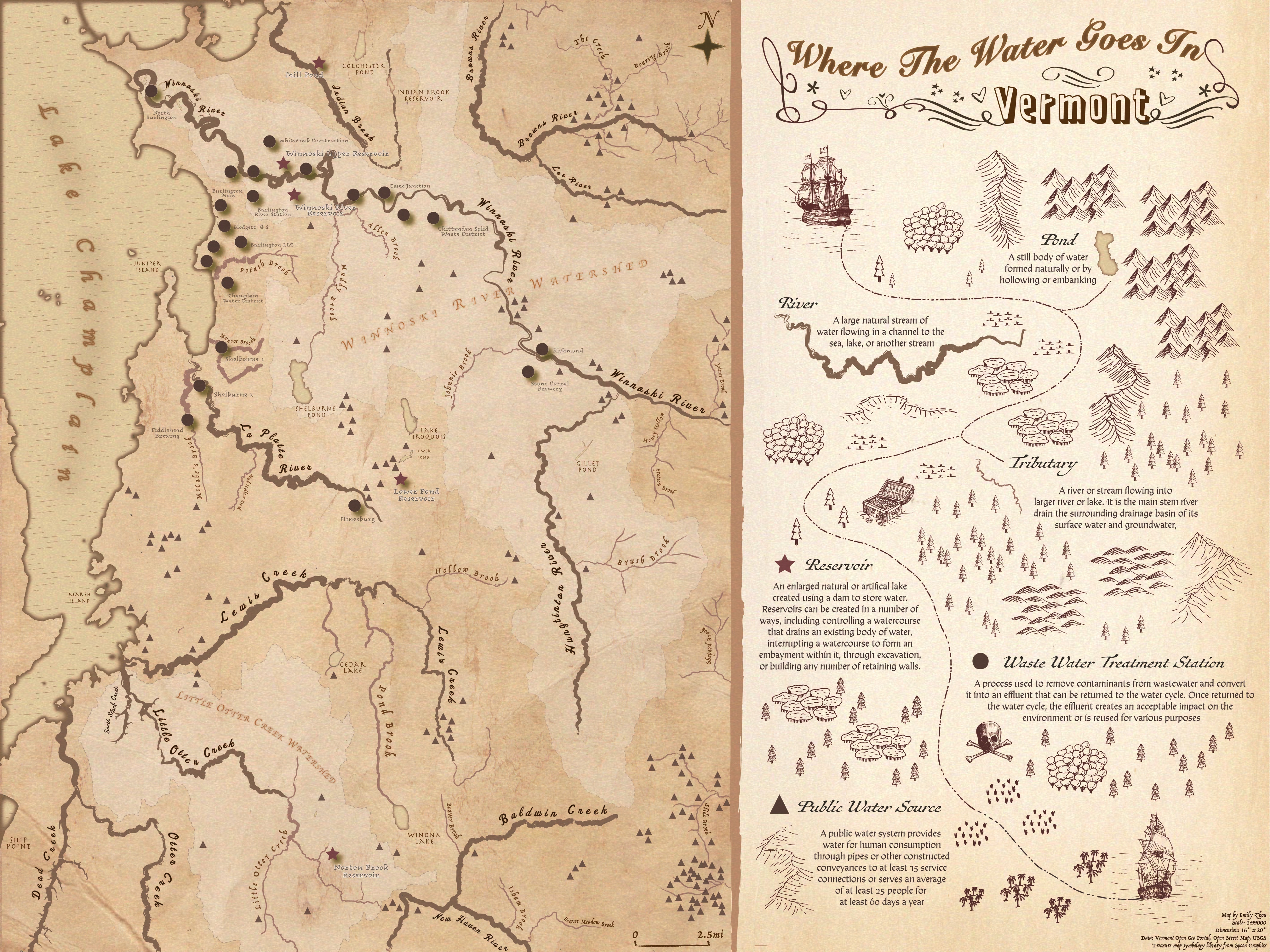
Monochrome Map - Where the Water Goes in Vermont
Map Layout
You may click here to see this map in better resolution
Design Narratives
This first map that I created shows the “mobility” of water in upper Vermont. This is a map designed for children in primary schools in Vermont, with the purpose of illustrating the natural world for them. The main idea behind is to creatively provide them with a spatial sense of how water, the most important natural resources we rely on, flow from one place to another, forming hydrological features (lakes, ponds, and river) and passing through anthropogenic infrastructures (public water sources, reservoirs, and treatment plant). For primary school kids, I assume that they have seen these water features in life themselves, but lack spatial awareness as to how they relate to one another, and thus this map could serve as a great learning tool for them.
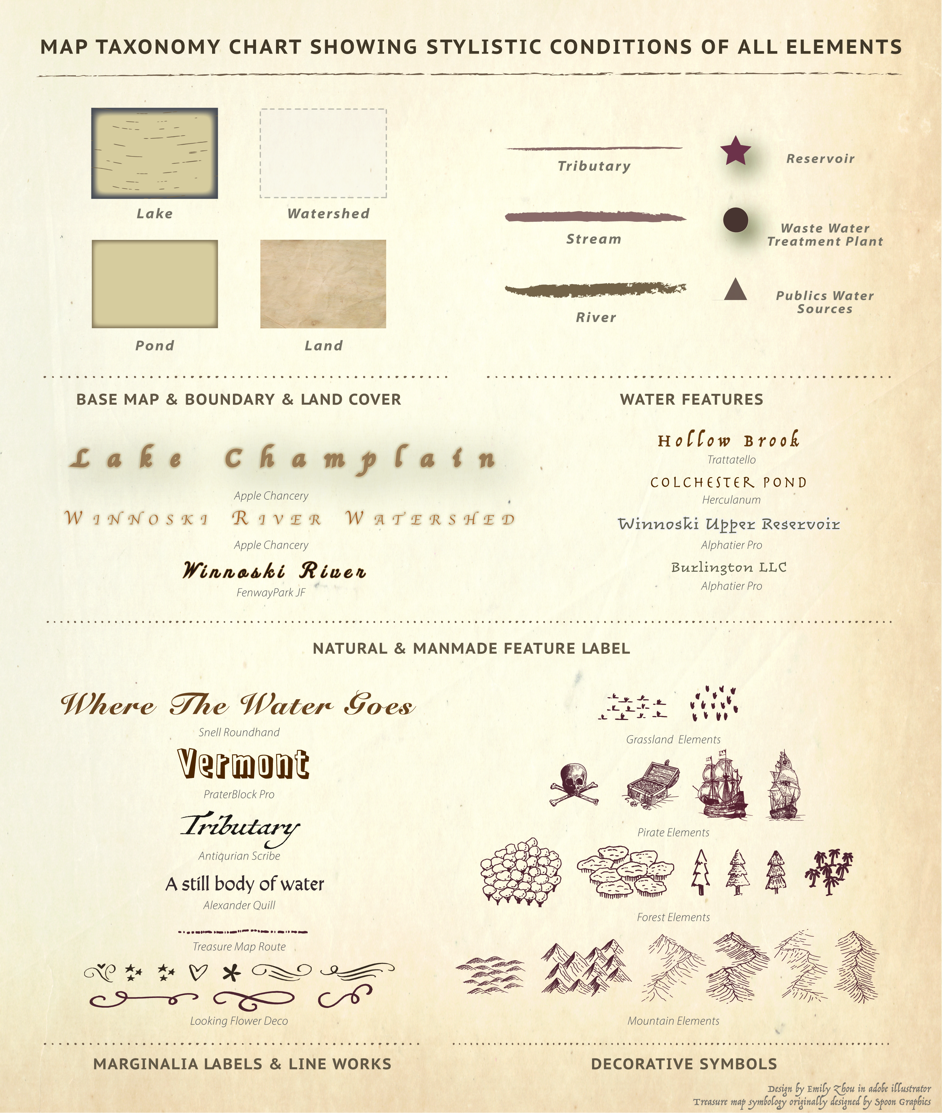
My inspirations come from three different sources: a vintage world map with antique fonts, symbologies and textures, a Japanese monochrome woodblock print I have in my room that uses this brownish color ramp, and several treasure maps that frequently appear in kids’ story books. With these in mind, I made the following design decisions to my map in terms of its visual hierarchies, taxonomy, and marginalia. I set up a visual hierarchy for natural water features such that streams that are wider in reality are represented with the thickest line and lake/ponds that are bigger have more layers of inner glow. Instead of adjusting stroke width, I made use of the different artistic stroke type in illustrator’s stroke library to render it a texture of antiquity and control the width. In addition to modifying the label sizes,I customize a wavy texture in illustrator’s swatch library to differentiate lakes from ponds. Within this process, I intentionally removed some small tributaries as these extra line works complicate the main layout without contributing much to the map’s purpose of illustrating water flow. I also set up a visual hierarchy for man made water features such that wastewater treatment plants and reservoirs are closer to the audience because of their relatively small numbers. Instead of using the actual reservoir or treatment plant symbology on the map, I chose simple stars and dots, which is easier for kids to identify, whom I also thought might not yet have a sense of using complicated map symbologies.
I have used a variety of vintage fonts in this map. Larger features such as watershed boundaries and lake champlain are labeled with the largest font size, but to avoid drawing too much attention from the audience, I applied outer glow, thinner stroke, lighter color, and modified the transparency to reduce their overall importance. Other water features are labeled with different fonts depending on the feature they associate with, whether it be major rivers, tributaries, or ponds. I applied the same font to man made features, some of them have an additional white stroke, which is to avoid clutter as many of these point data are in close proximity. I chose not to label public water sources in this case because the large number of extra labels would further complicate the layout and does not contribute to the kids’ understanding.
Considering that this map is for kids, I thought about designing the marginalis in a creative and engaging way. When I was little, I loved playing around with treasure maps and have drawn several of them to illustrate places at home where I hide my favorite toys and snacks. Since the map is titled with the question “Where the water goes in Vermont”, I thought about adapting elements from treasure maps, such as using a pirate ship, to lead the kids to figure out where water actually goes. The legends, therefore, appear along with these treasure map elements.
Instead of viewing this as a web map, my hope is that it could be printed and folded into a leaflet for kids to play around with, which is why there’s a thick brown line between the map and the marginalia. In terms of the intellectual hierarchy of the entire layout, I expect the kids to notice the map title first and quickly become interested in the marginalia, where they will follow the pirate ship and read through the legends and the definitions of water features. They will then proceed to identify those features on the map and get a sense of their spatial relationships.
On the map, I expect them to first notice major rivers, lakes, and reservoirs, followed by tributaries and water sources. After spending a while appreciating these more prominent features, they could delve into the background and get a sense of how these elements relate to each other in watershed.
Map Taxonomy Chart
You may click here to see this map in better resolution